HTML Input Elements


HTML Elements are the building blocks of a web page. They define the structure, content, and design of a webpage. Some of the most commonly used HTML elements include headings, paragraphs, lists, links, images, and tables.
Text Input:
The text input element, <input type="text">, is the most basic and commonly used form input. It allows users to enter single-line text data, such as names, addresses, or messages. Developers can specify additional attributes like placeholder to display a hint to users and maxlength to limit the number of characters entered.
<form>
    <label>Name: </label>
    <input type="text" name="name" placeholder="Enter your name">
    <br><br>
  </form>

Password Input:
The password input element, <input type="password">, is similar to the text input element but masks the characters entered by the user. It provides a secure way to collect sensitive information, such as passwords or PIN numbers. Like the text input, it supports attributes like placeholder and maxlength.
<form>
    <label>Password: </label>
    <input type="password" name="password" placeholder="Enter your password">
    <br><br>
</form>

Checkbox Input:
The checkbox input element, <input type="checkbox">, presents a binary choice to the user. It allows users to select one or multiple options from a predefined list. Each checkbox input should have a corresponding <label> element for accessibility and better usability. The checked attribute can be used to preselect checkboxes by default.
<form>
    <label>Select your favorite fruits:</label><br>
    <input type="checkbox" id="apple" name="fruit" value="apple">
    <label>Apple</label><br>
    <input type="checkbox" id="banana" name="fruit" value="banana">
    <label>Banana</label><br>
    <input type="checkbox" id="coconut" name="fruit" value="coconut">
    <label>Coconut</label><br>
    <input type="checkbox" id="Blueberry" name="fruit" value="Blueberry">
    <label>Blueberry</label><br>
    <br>
    <input type="submit" value="Submit">
</form>

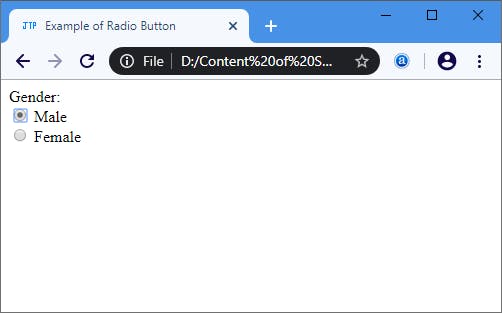
Radio Button Input:
The radio button input element, <input type="radio">, is similar to checkboxes but allows users to select only one option from a list. Radio buttons are typically grouped using the name attribute to create a mutually exclusive selection. The checked attribute can be used to preselect a radio button.
 <form>
    <label>Select your gender:</label><br>
    <input type="radio" id="male" name="gender" value="male">
    <label for="male">Male</label><br>
    <input type="radio" id="female" name="gender" value="female">
    <label>Female</label><br>
  </form>
Dropdown List Input:
The dropdown list input element, <select>, creates a list of options that users can choose from. It is often used when there are multiple selectable options but limited screen space. Each option is defined with the <option> element, and the selected option can be defined using the selected attribute.
 <form>
    <label for="country">Select your country:</label><br>
    <select id="country" name="country">
      <option value="usa">United States</option>
      <option value="canada">Canada</option>
      <option value="uk">United Kingdom</option>
      <option value="australia">Australia</option>
      <option value="japan">Japan</option>
    </select>
    <br><br>
    <input type="submit" value="Submit">
  </form>

Textarea Input:
The textarea input element, <textarea>, provides a larger text input area for users to enter multiple lines of text. It is suitable for capturing longer messages, comments, or descriptions. The rows and cols attributes can be used to define the visible size of the textarea.
 <form>
    <label for="message">Enter your message:</label><br>
    <textarea id="message" name="message" rows="4" cols="30" placeholder="Type your message here" required></textarea>
    <br><br>
    <input type="submit" value="Submit">
  </form>

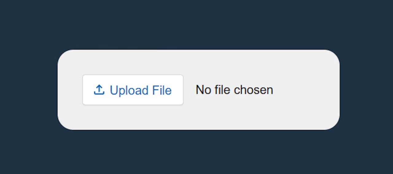
File Input:
The file input element, <input type="file">, allows users to select and upload files from their local system. It provides a file selection dialog when clicked, and the selected file(s) can be accessed using JavaScript. Developers can limit the file types accepted using the accept attribute.
 <form>
    <label>Upload File</label><br>
    <input type="file" id="file" name="file">
    <br><br>
    <input type="submit" value="Submit">
  </form>
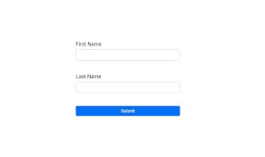
Submit Button:
The submit button input element, <input type="submit">, is used to submit a form to the server for processing. When clicked, it triggers the form submission and can include additional attributes like value to specify the text displayed on the button.
  <form>
    <label for="firstName">First Name:</label>
    <input type="text" id="firstName" name="firstName" placeholder="Enter your first name" required>
    <br><br>
    <label for="lastName">Last Name:</label>
    <input type="text" id="lastName" name="lastName" placeholder="Enter your last name" required>
    <br><br>
    <input type="submit" value="Submit">
  </form>
Conclusion:
HTML input elements are essential components for building interactive web forms. They enable users to input and submit data, making websites more functional and engaging. By understanding the various input types, their attributes, and how to utilize them effectively, web developers can create user-friendly forms that cater to diverse user input requirements.